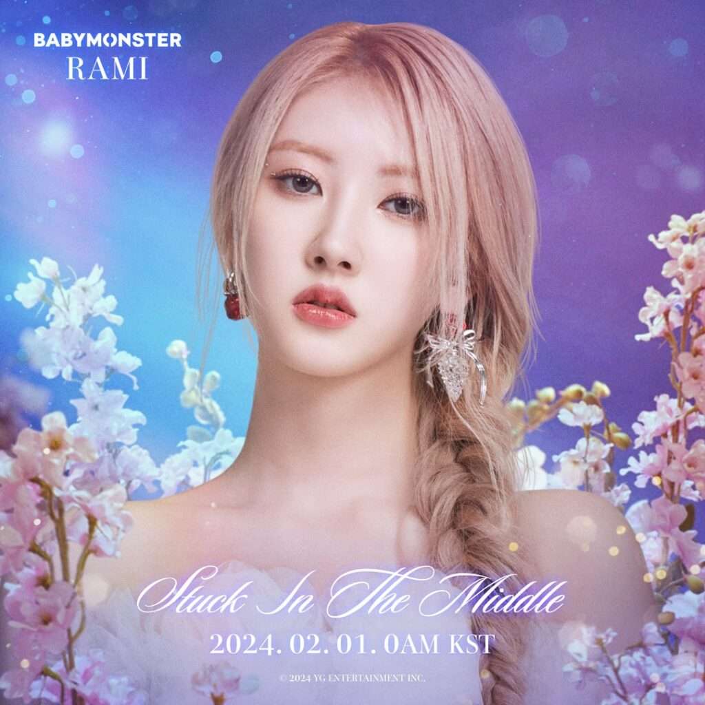
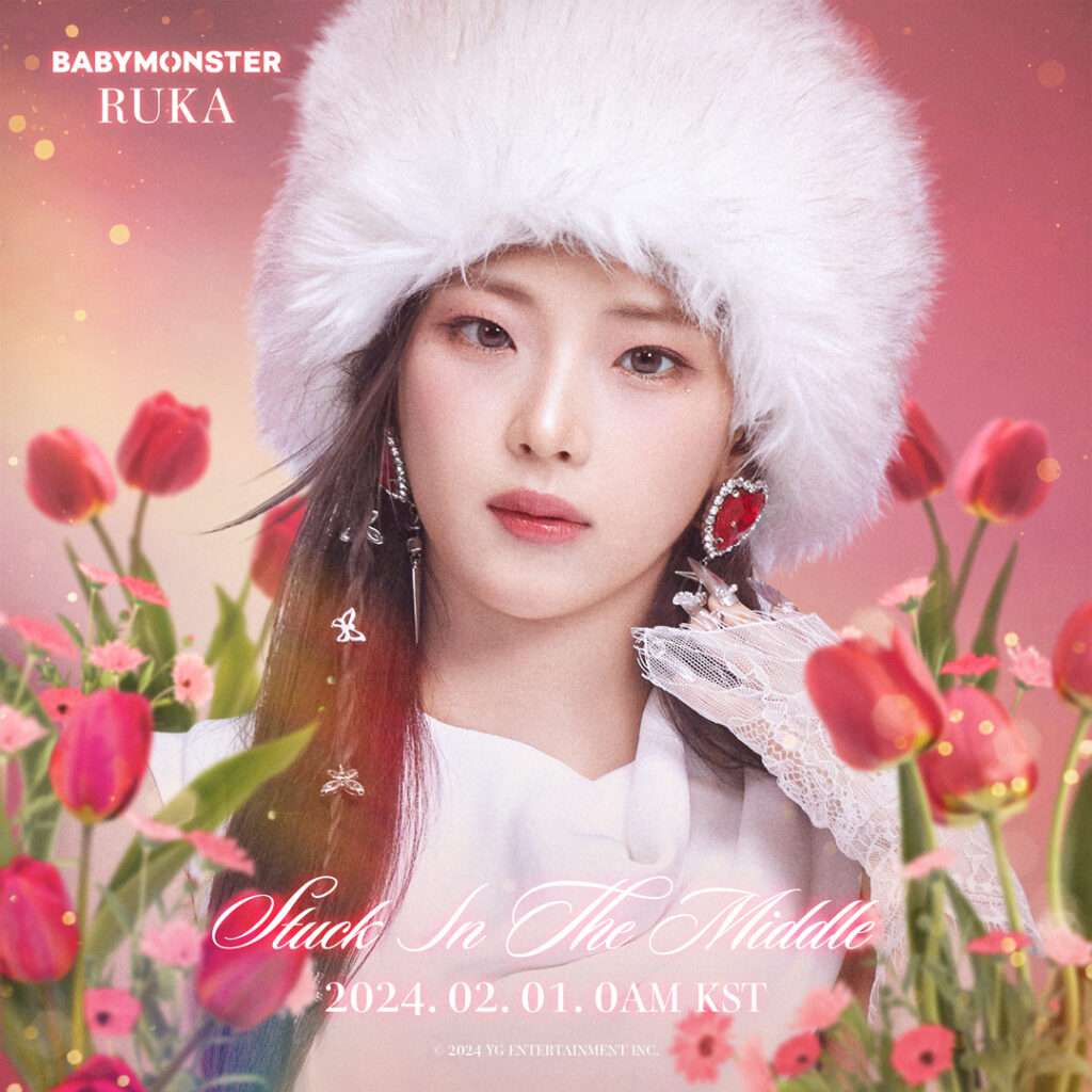
BABYMONSTER ‘Stuck In The Middle’ I CHARACTER POSTER Rami Ruka


1. What the hell is this? They look like an ad for a female character in a Chinese game ㅠ
2. They look like Japanese female idols from the 2000s
3. Has YG ever had the style like this? Have they abandoned the hip-hop style?
4. Are they doing this on purpose???
5. What’s really going on with YG’s concept…?
6. Seriously, they look like a rookie group from a small to medium sized company with 2 employees. What is that design?
7. Quality is really disappointing
8. But does this work abroad???
9. Last time it was Chinese style, this time it’s Japanese style, I guess next time it will be Korean style
10. Wow, it looks like it was made by a Chinese fanclub
11. Doesn’t YG see the community’s reactions..? They are constantly criticized for their quality, but nothing changes
12. It’s like a cosmetics ad
13. But YG is always like that and has no taste in design
14. It’s like a Chinese game
Original post (1)


0 Comments